Many of you will be very happy with the following announcement: we have improved the y-axes!
This article contains:
New situation vs. old situation
What effect have these changes in my existing charts?
Take control of your charts
New situation vs. old situation
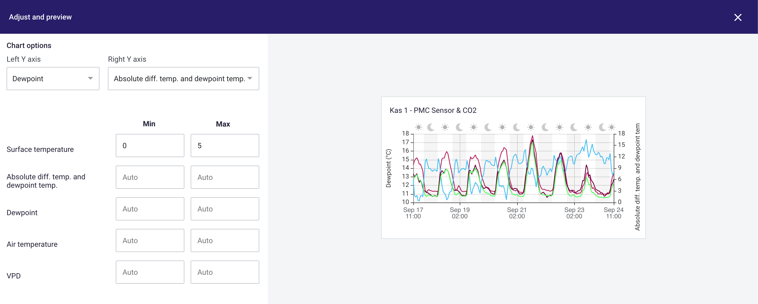
There have been made a few changes to the y-axes in the platform. And these changes can make a huge impact for analyzing the data. But what did we actually change?
Before, the y-axes in the platform were predefined and not editable. Now you are able to define your own y-axes. You can choose which metric should be plotted on the left y-axis and which metric on the right y-axis.
So now you are able to define how you want to plot the left and right y-axis. But what happens when you add more than two metrics to the chart? Before, when the chart was filled with more than two metrics, the data was plotted on the left y-axis. Now all the other metrics, that are not plotted on the left or right y-axis, have their own "invisible" y-axis. So this means that your charts can actually have more than two y-axes.
But what about the y-axis range? Yes, we have improved this as well. For every chart, you can define the range of the y-axis per metric. Just by filling in the min and max when creating or editing charts.
What is the effect of these changes on my existing charts?
Of course, these changes do affect the existing charts in your dashboards. Charts with more than two metrics involved, do look different because of the result of the "invisible" y-axis. As an example, the image below gives an idea of what the effect is of these changes.
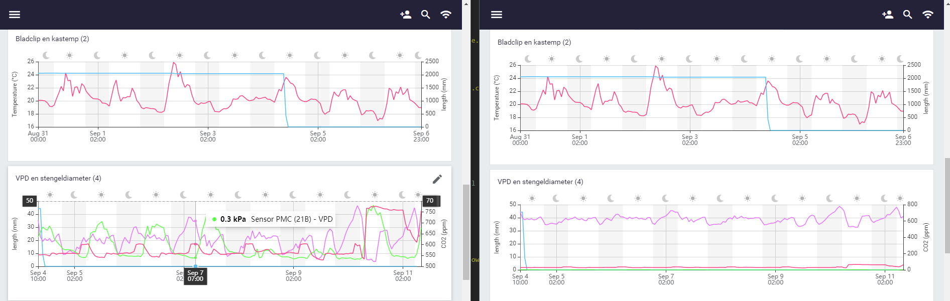 Effect on existing charts shown in new situation (left) and the old situation (right).
Take control of your charts
Now it's time to take control and adjust your own y-axes. Click here to find out how to.