We are happy to announce a new platform update! This update has been requested many times in the past years, and now we are ready to show what you all have been waiting for.
We have updated our color use in graphs. In the old situation, the choice of colors for the data lines in the graphs were given in alphabetic order. The first data line (sensor name starting with an A for example), was always blue, second always red, etc. This confused a lot of you, so it was time for a change!
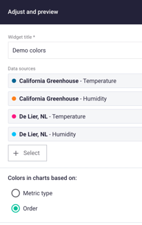
In the new situation, there are two ways of using the colors in the graphs. You can choose your color situation per widget. When adjusting or creating a widget, you can choose for colors based on metric type or by order.
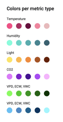
Colors per metric type
Every metric type is matched with a color. So temperature is pink, VWC is blue, etc. For the ones that like to know which colors we have matched to certain metrics:
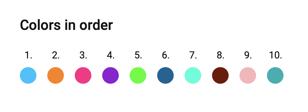
Colors in order
The second option is that the colors from the lines are shown in a certain order. So the line will always be blue, the second line will always be orange, etc. See the image underneath for the color pallet with the order.
Any questions? Just send us a message by clicking on the blue help button!