For every chart within your dashboards, you are able to set the range and the metric per y-axis.
This article contains:
Y-axes and metrics
Y-axes ranges
How to set your y-axis
How to set the y-axis for a new chart
Changing the y-axis from an existing chart
Changing the y-axis in Explore
Y-axes and metrics
The chart is visualized, based upon two y-axes (left and right). The metrics for these two y-axes are predefined but can be changed when creating or editing a chart. When there are more than two metrics in the chart, the data will be visualized with "invisible" y-axes. This means that a chart can have more than two y-axes.
Y-axes ranges
As a default, the platform will set the range based on the measured data. You can change this per metric by filling in the Min and Max when editing the widget.
How to set your y-axis
You can set the y-axis to your own preference. This can be done when creating a new chart or when editing an existing chart.
How to set the y-axis for a new chart
Take the following steps to set the y-axis for a new line or bar chart.
- Go to a dashboard that you would like to add a new line graph or bar chart to
- Click on + Add widget
- Choose the chart that you would like to create (line or bar chart)
- Choose the aggregation that you would like to use for your chart.
- Fill in the widget title, select your data sources, and set the interval and period settings.
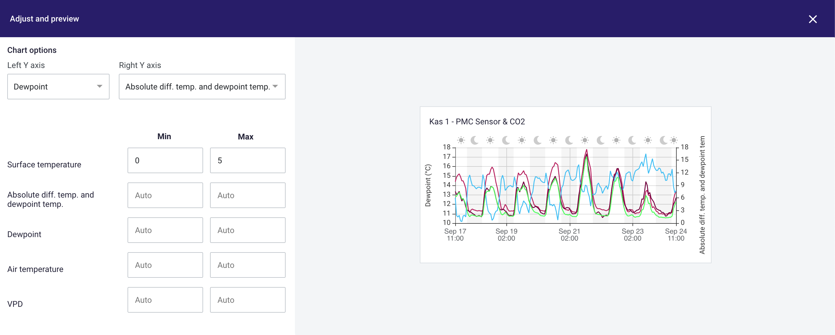
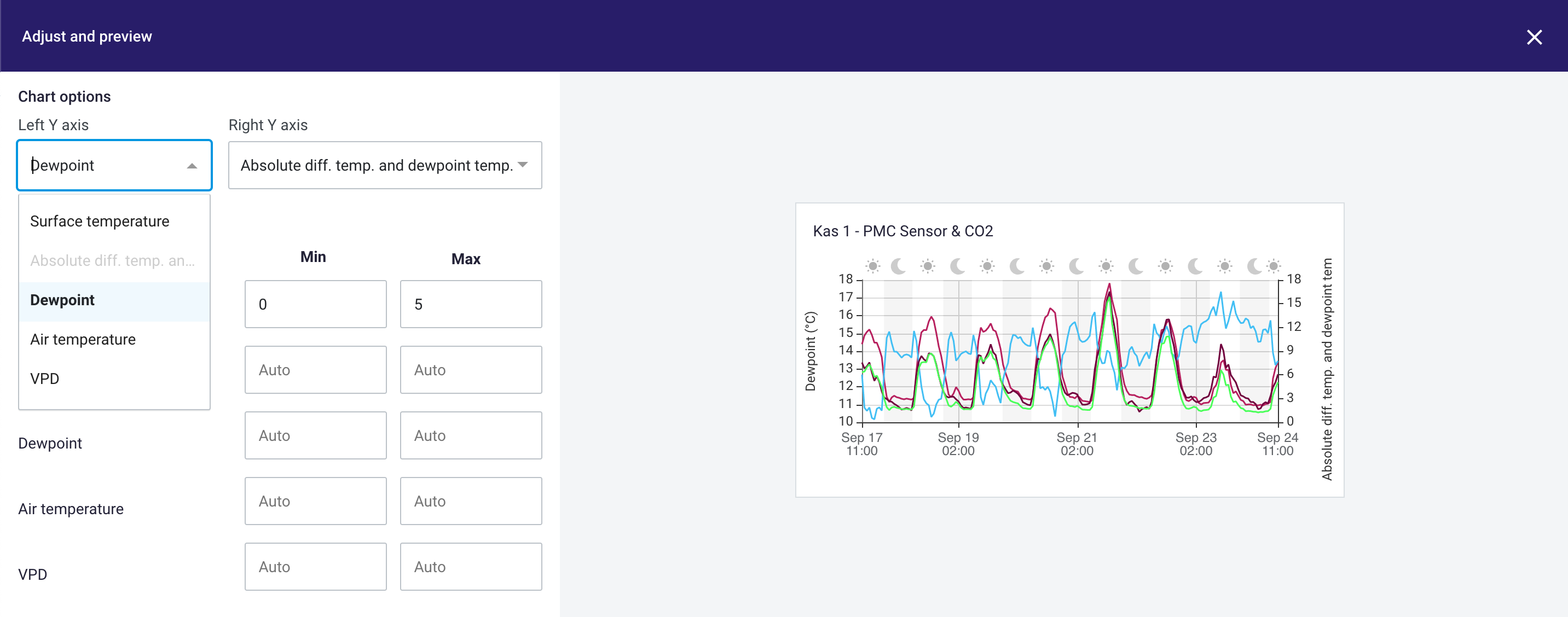
- Scroll down, under Units, to set the Chart options.
- Select the left Y-axis and the right Y-axis by clicking on the predefined metric.
- If needed, fill in the y-axis range per metric. If the y-axis is not filled in, the platform will automatically fill in the range based on measured data.
- Click on Create to save your widget.
- Your widget is now added to your dashboard!
Changing the y-axis from an existing chart
When a widget is already saved, you are still able to edit the widget to your preferences. Take the following steps to change the y-axis settings from your existing widget.
- Hoover to the widget. The edit pencil will appear in the right top of the widget.
- Click on the edit pencil to edit your widget
- Scroll down till Chart options appears
- Adjust the left Y-axis and the right Y-axis by clicking on the set metric.
- If needed, fill in or adjust the y-axis range per metric. If the y-axis is not filled in, the platform will automatically fill in the range based on measured data.
- Click on Create to save your new settings.
-
Your widget is now adjusted!
Changing the y-axis in Explore
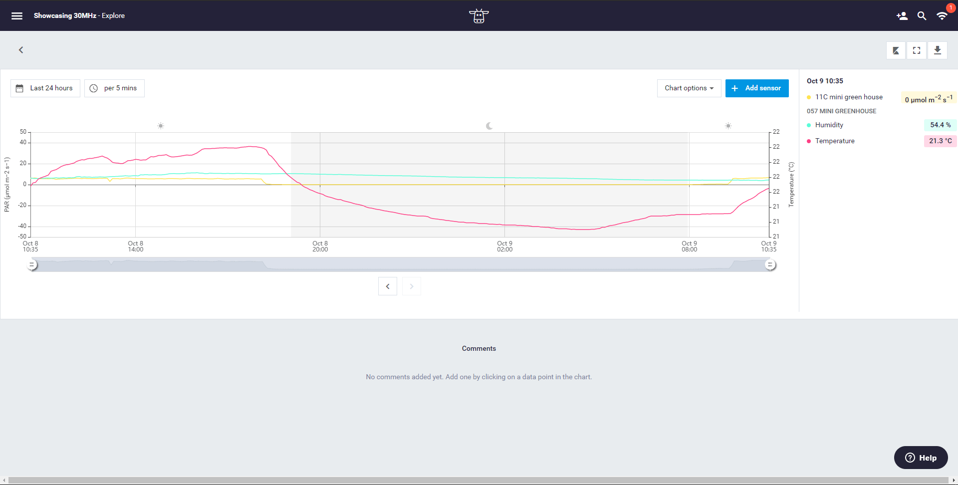
You might want to change your y-axis in Explore when you are viewing data from more than two metrics. You can plot a different metric on the left y-axis, through the legend. Just click on the metric that you want to plot on the left y-axis. The platform will automatically change the y-axis and the visualization of the data.