At Explore, you can read the information from all of your data sources with various options to narrow down the exact information you are looking for, and even export them. We will take you through all the Explore options that are available.
Tip: do you want to view the graph in full screen? Just click on the square button at the right top of the page: ![]()
This article contains:
Select the data sources that you want to explore
Select time periods and intervals
Change chart options in Explore
Change statistic type and chart type per data source at the legend
Set your y-axis at the legend
Zoom into your data with the zoom bar
Exporting your data through Explore
Select the data sources that you want to explore
We will show step by step how to add data sources to the graph:
- Click on a widget to get directed to Explore
- Now you can analyze your data from that widget
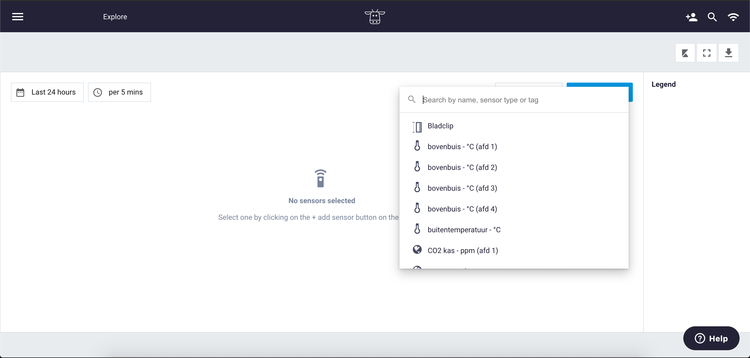
- If you want to change or add a sensor, click on + Add data source at the top on the right side of the page
- Search to find the data source. Tip: use data source filters to search efficiently.
- Select the data source (or multiple data sources) and - if optional - (de)select metrics
Select time periods and intervals
By default, the graph shows data from the last 24 hours with an interval of every 5 minutes. Of course, you have various options so you can find the right insights.
At the left of the page, above the graph, you can adjust the time period and interval. The title of the buttons is the time period and interval that is the current setting from the graph.
For the time period, it is possible to select a custom range. There are two options: a relative period or an absolute period. Use the option relative period when you would like to show the data from the last X hours, days, weeks, or months. Use the absolute period option when you would like to select a specific date range.
The options that you have for the interval is: per 1 min, per 5 mins, per hour, per day, per week and per month.
Change chart options in Explore
Go to Chart options next to + Add data source to adjust the chart. Here you can:
- Change view settings for sunrise and sunset settings
- Change view settings for comments
- Change view settings for the chart tooltip
- Change view settings for the week numbers
Change statistic type and chart type per data source at the legend
After selecting the data source, you will see the data as a line graph. You can change this per data source in the legend.
Next to the graph, on the right side, you will find the legend. The legend will show the data sources that are visible in the graph with the status from the moment that you are viewing your graph. So when you are hovering over your graph, the data status in the legend will change to the right moment. At the legend, you are able to change the settings from the specific data source that you are viewing in the graph. Just click on the three dots to change the settings from the data source. The settings that can be changed are statistic type and chart type.
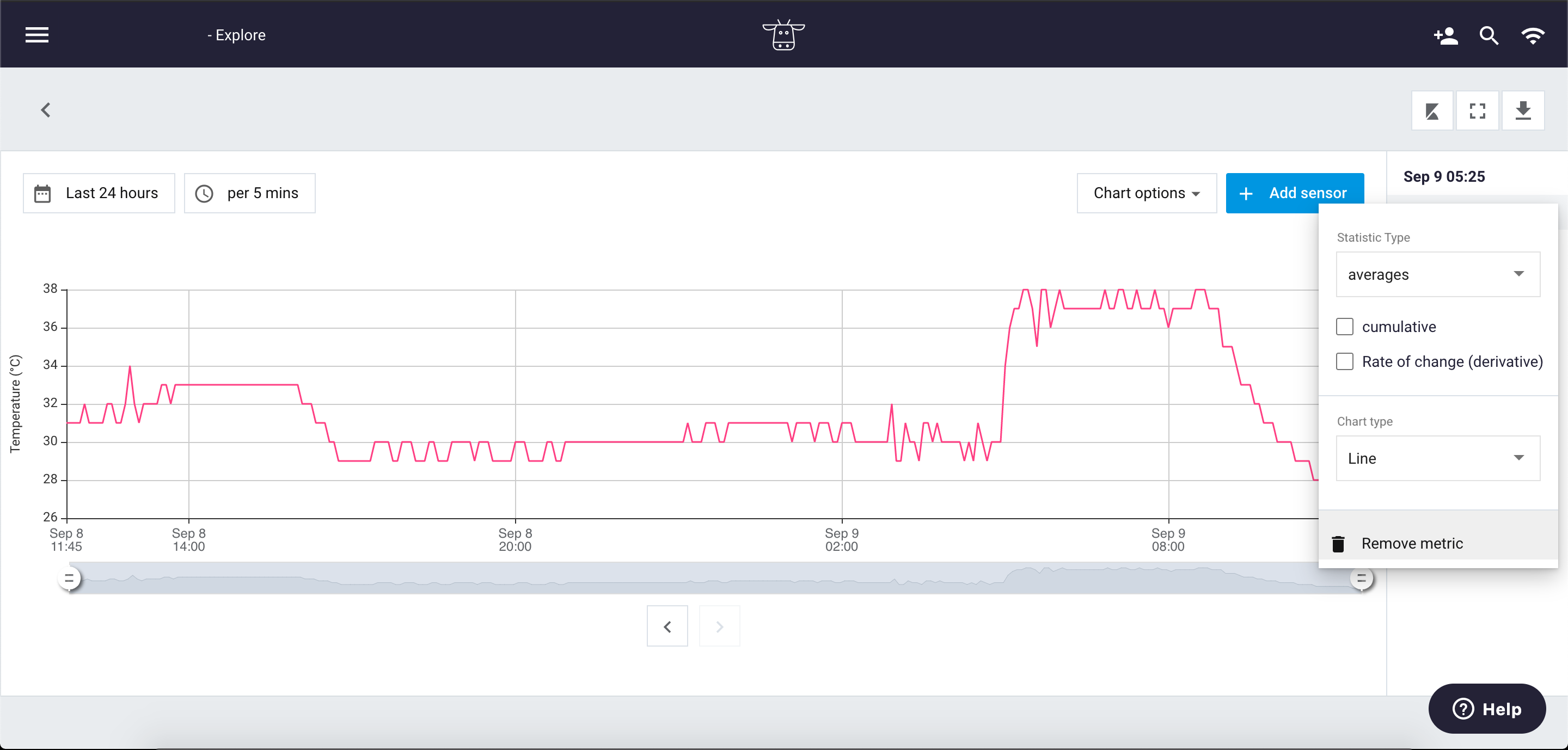
Statistic type
There are three statistic types: averages, min and max. The default is averages. This can be set for every data source separately. On top of the statistic type, you can choose to show the data cumulative or in Rate of Change (derivative).
Chart type
When you add data to the graph, the default of the chart type is Line. But there is another option available, the bar chart. Just like the statistic type, the chart type can be set per data source. So within Explore you are able to combine the line and bar chart in one by using multiple data sources.
Set your y-axis at the legend
You might want to change your y-axis in Explore when you are viewing data from more than two metrics. You can plot a different metric on the left y-axis, through the legend. Just click on the metric that you want to plot on the left y-axis. The platform will automatically change the y-axis and the visualization of the data.
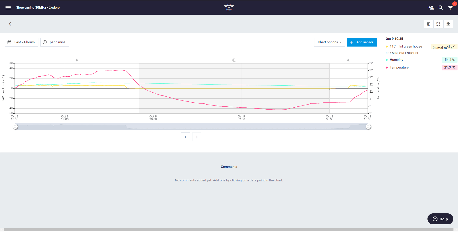
Zoom into your data with the zoom bar
Just zoom in to your data by using the zoom bar. You can find the zoom bar underneath the graph. You can also zoom in (as with many applications) with the keyboard combination Ctrl + or by using your mouse wheel, touchpad, or touchscreen.
Exporting your data through Explore
Would you like to export the data that you have viewed in the graph? Just click on the download button:

This downloads a csv in the format your data is currently showing in the graph (with the same period, interval and metric that are active).